
UX Case Study.
Seamless user experience for flight booking app.
My client is a start-up airline called GoFly. They’re looking to create an online experience that is fast, easy, and intuitive: one that’s based on a deep understanding of their target users.
Scope: Professional Diploma in UX Design
My Role: UX Designer
Duration: Summer 2020 - Spring 2021
Tools: Figma, InDesign, Photoshop, Illustrator, SurveyMonkey, Reflector, Screenflow.
The problem.
It is no news that millions of users around the world are regularly faced with the burden that booking a flight online represents. The industry is packed with badly designed applications delivering very poor user experience. As a result, airline websites have the highest abandonment rates - over 88% of users in 2020 abandoned the process before completing the booking. This translates into a significant negative impact for the company not only on Revenue but many other aspects such as costs, customer acquisition and retention.
The solution.
To focus on the user goals so we can remove friction points and incorporate flawless UX into this new flight booking app, allowing users to flow through the software and get to the other side as smoothly as possible.
My role.
To design the mobile application focusing on the flight booking process: how users search for, find and select flights online. My end goal is to design and build a clickable prototype that can be tested with users, along with a detailed set of wireframes.
My design process.

Deep diving into research.
I approach the start of the process with genuine curiosity and determined to find out what are the impediments the users are facing along the funnel that delivers so much frustration.
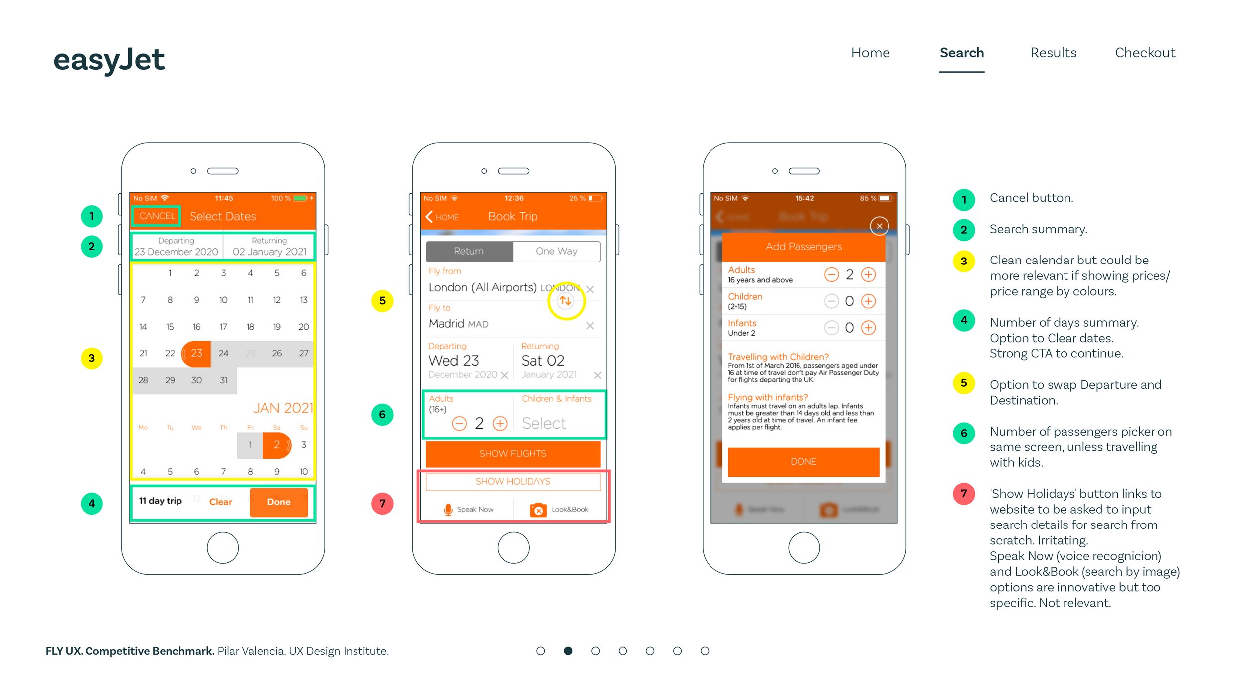
I start the research process by completing a competitive benchmark analysis on four of the leading flight booking apps so I can identify conventions and best practices at high-level user flow. I will look at what other airlines are doing, learn from their mistakes and take inspiration from the things they do right so I can use that information to focus my research and ultimately improve your designs.
I also carried out an online survey with ten open and close-ended questions. The most significant findings are:
58% of users completed the booking the same day
73% of users used desktop devices
What participants liked the most is the easiness of the process, clear CTA’s and calendars displaying price comparison
What most disliked the most is the hard-selling of extras and services, too many clicks to complete the booking and unclear pricing throughout

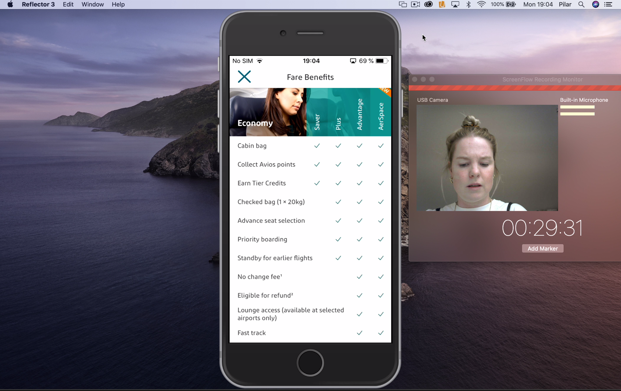
I carried out two usability tests and interviews in-depth on two users with different profiles so I could generate more qualitative data. I found this research technique exhilarating but also critical in order to learn from users about their problems. I prepared the technical set-up in my own studio and invited the two participants on different days. The software I connected the mobile the user was going to be given with the apps to test and the laptop with the cam to record their reactions and my desktop computer so I could observe and record both together, what the user is doing with the app and their reactions.
Other research techniques were considered such as card sorting, stakeholder interviews, A/B testing and heuristics.

Empowering the user’s voice.
With the raw data acquired in the research phase, I invited three designers to join me on a remote affinity diagram session via Miro. By the end of it, we had a well structured display of data organised into logical groups that reflected each step of the user journey while going through the booking process. Positive features and pain points were highlighted making it clear already where the friction and frustration in the user’s journey start building up to gather momentum when exposed to the Fares and Extras options and missinformation.
From there, I developed a customer journey map echoing each of the steps at high-level flow the user undertakes when going through the process of booking a flight, including the travel decision at the very start and the user’s goals, mental models, behaviours and pain points at each step. The result is a highly structured and easy to understand visual map that shows at a glance all the above and also the user’s emotional journey in parallel to the UX quality.
Other analytics techniques learnt during the programme are triangulation, personas, customer value curves and empathy maps.


Design.
User flow diagram.
With the affinity diagram and the customer journey map in front of me, I am going to decide on a clear structure, navigation and user high-level flow. I start by sketching on paper the high-level flows and screens I need to facilitate so the user can go through the booking process and have a frictionless but also meaningful experience.
One of the statements from the users that resonates stronger in my head is that they crave for fewer steps as possible to complete the booking and ask to be exposed to the least amount of options and offers as possible so they can intuitively and fast complete the journey and move on.

Interaction design.
After having a clear idea of the final navigation structure of the app, I start by defining what interactive elements are necessary to include on each screen and how they respond when users touch or enter data.
Another of the main learnings from the user tests that also resonates with me and reflects my approach to design is to use the minimal elements needed to complete the interaction and avoid by all means visual fog by adding elements that are not strictly necessary for the user to complete the booking. The main informed decisions I make are:
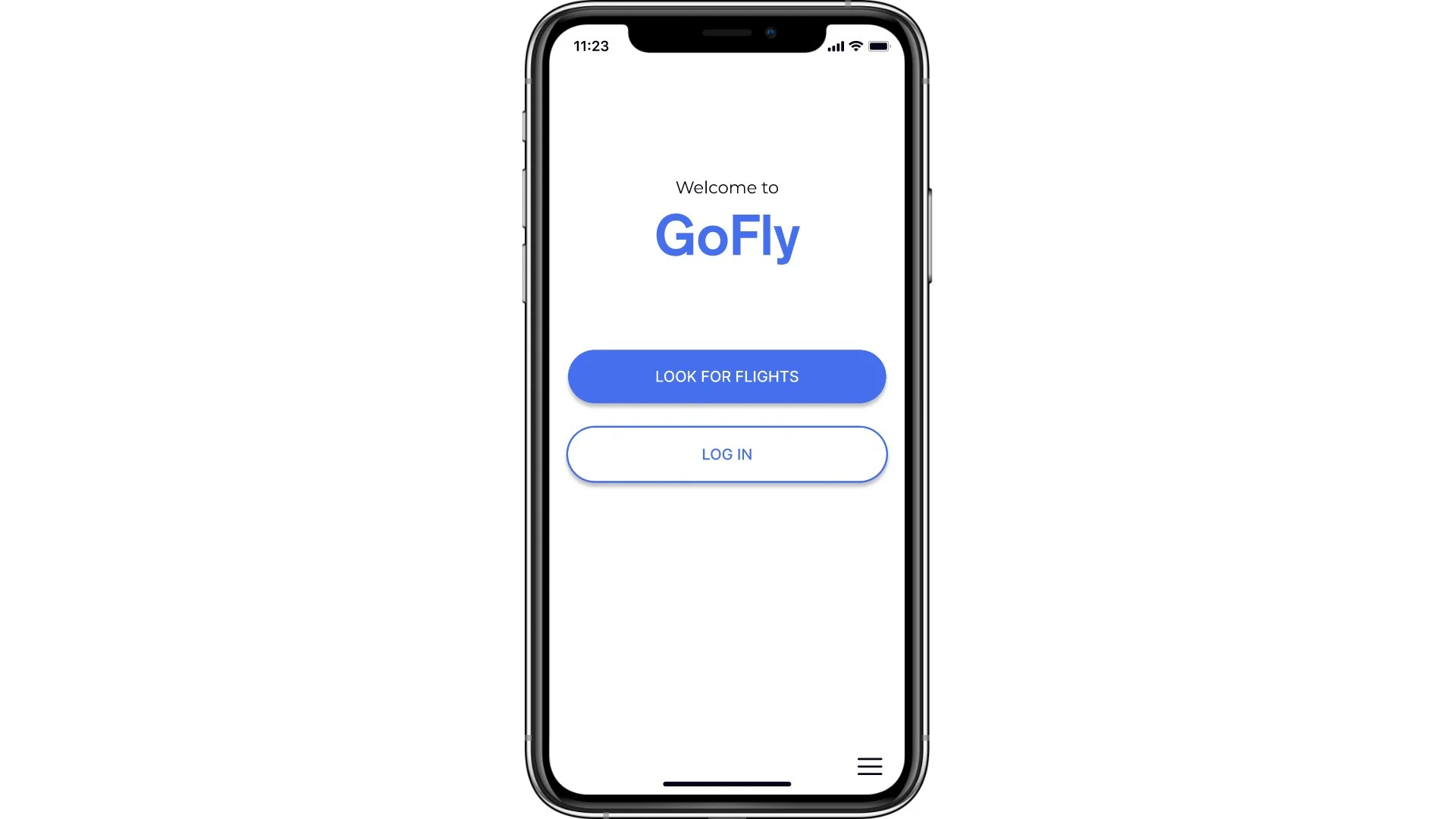
Landing page with only 2 clear options. Book a flight or Log In
The home screen will present the user with the interactive elements by progressive disclosure which will deliver not only a clutter-free screen at each stage but also won’t overwhelm the users offering too many decisions at once.
Progress tracker to inform the user always of where they are.

Medium fidelity prototype in Figma.
With the interaction and screens designs well defined in my sketches, I will use Figma to create a mid-high fidelity prototype so I can user test and iterate before I pass it onto developers.
Wireframes for developers.
Once the prototype is validated and the visual design finalised, I will prepare the wireframes documenting what interactive elements go each screen, and what are the rules and the feedback to provide the user in different scenarios.

A happy end.
It’s been a fascinating journey and despite not being a commercial project, the learnings are many, to highlight the most relevant:
Research is everything, designers should always inform their decisions and validate assumptions based on research.
A clear understanding of the UX design process and the importance of each step.
The beauty of qualitative data.
The importance of prototyping, user testing and iterating to help shape the final product.
